Table of Contents
What Is Corporate Memphis? Defining the Corporate Art Style
Origins and Evolution: From Memphis Group to Big Tech Aesthetic
Why Corporate Memphis Took Over: Practical Benefits and Strategic Limits
Backlash, Fatigue, and the Search for a New Corporate Art Style
Corporate Art Beyond Screens: Visual Language in Physical Spaces
How Onward Helps You Build a Cohesive Corporate Art Style
Frequently Asked Questions
Between 2017 and 2022, a single corporate art style quietly colonized the internet. Flat, bright, and populated by featureless blue people with bendy limbs, it appeared on every SaaS landing page, HR portal, and investor deck. That style – Corporate Memphis – became so ubiquitous that it stopped communicating anything at all. If your organization still relies on generic vector graphics while your offices house a curated collection of paintings, sculptures, or commissioned murals, there is a disconnect worth addressing.
This article will help you evaluate Corporate Memphis and other design styles, then choose a visual language that supports your brand, your corporate culture, and your business goals. At Onward, we see the impact of visual language daily while helping organizations manage and present their fine art collections across offices, campuses, and public spaces.
What Is Corporate Memphis? Defining the Corporate Art Style
Corporate Art Style is often known as Corporate Memphis or Alegria – a somewhat pejorative label for the bright, flat illustration style adopted by big tech companies like Facebook, Google, Slack, and Lyft from roughly 2017 to 2021. The term corporate Memphis comes from its loose stylistic connection to the 1980s Memphis Group, though the two share aesthetics more than ideology.
The visual traits are instantly recognizable: flat design, vector graphics, simplified geometric shapes, oversized limbs, small heads, small torsos, and non-representational skin colors (the famous blue people, purple people, teal people). The style features flat human characters with disproportionate features – characters that resemble humans but strip away facial features and specific identifiers. Corporate Memphis uses bright colors without blending or gradients, and it aims to appear friendly and accessible to audiences. Think of a generic big tech homepage where all the people look interchangeable, performing vague tasks with simple shapes and basic shapes floating around them.
Corporate Memphis originated from Facebook’s Alegria design system in 2017, commissioned from BUCK Studios. Facebook adopted this illustration system, and within two years thousands of companies followed. The style is designed to be easily replicated by different artists and serves a commercial and functional purpose rather than artistic expression. It became the default big tech art style – but it is just one corporate art style among many.
Origins and Evolution: From Memphis Group to Big Tech Aesthetic
The lineage runs from postmodern furniture to your onboarding screen. Understanding it helps you see why the style feels both familiar and exhausted.
The Memphis Group and Postmodern Roots
Corporate Memphis is named after the 1980s Memphis Group – the Memphis Milano collective founded in 1981 in Milan. The Memphis Group rejected functionalism for playful shapes and colors: clashing teal and magenta, checkerboard motifs, zigzags, and deliberately ostentatious furniture. Pop-culture echoes appeared everywhere from Saved by the Bell sets to Beetlejuice. Corporate Memphis borrows the superficial fun – bold colors, childish patterns, playful geometry – but strips away the critical, anti-establishment edge. What began as anti-design became the safest possible design.
Modernist Illustration and Flat Design
Modernist illustration influenced Corporate Memphis through simplified forms and colors. Mid-century illustrators like Mary Blair and Charley Harper pioneered color blocking and stylized abstraction that foreshadowed today’s flat art. The critical turning point came in 2013, when Apple released iOS 7 and abandoned skeuomorphic design – the leather textures and beveled edges – in favor of flat, minimalist interfaces. Google’s Material Design followed in 2014. This shift primed the entire web and media landscape to accept flat illustration as the default aesthetic.
The Millennial Aesthetic and SaaS Branding
The broader millennial aesthetic of the 2010s – soft pastels, rounded UI, clean white space, friendly sans-serif typography – created the perfect environment. Corporate Memphis emerged from nostalgia for 1980s design in the late 2010s and dovetailed with this look on SaaS homepages, HR portals, and onboarding flows. The aesthetic became popular among tech companies from 2018 to 2021, particularly venture-backed startups wanting to appear trustworthy yet playful across the creative industry and tech industry alike.
Why Corporate Memphis Took Over: Practical Benefits and Strategic Limits
There are real reasons many designers, graphic designers, and illustrators embraced this art style. There are equally real reasons it fails. Understanding both helps you make a smarter choice.
Performance, Scale, and Design Operations
Vector graphics offer tiny file sizes, infinite scalability, and easy theming. Corporate style focuses on mass production and modular designs for ease of adaptation – an infinitely scalable system that design teams can deploy across web apps, mobile apps, and internal dashboards without custom art direction. In 2020, a global SaaS platform could update thousands of UI screens by swapping one illustration library instead of commissioning hundreds of photos. The aesthetic is often viewed as a cost-cutting measure in design, and that view is not entirely wrong.
This style emphasizes consistency and uniform brand identity across projects. Remote collaboration after 2020 favored standardized illustration kits that any designer on the project could assemble. The result: corporate art often avoids controversial themes to ensure neutrality, and the corporate art style is used to project brand identity and enhance employee well-being – at least in theory.
Inclusion, “Blue People,” and the Question of Representation
Corporate Memphis uses non-representational skin tones for inclusivity. The logic: abstract skin tones avoid over-simplified racial categories, allowing characters to represent diversity without tokenism. But critics argue this approach erases real cultural markers and makes people bland – flattening individual identity into color blobs. Imagine internal DEI training illustrated with generic blue figures versus photography of actual employees. The latter creates human-level interaction and trust. The former feels sanitized.
Backlash, Fatigue, and the Search for a New Corporate Art Style
By early 2022, Corporate Memphis had become shorthand for soulless big tech. Critics describe Corporate Memphis as soulless and lazy. The style is criticized for its lack of individuality, and Corporate Memphis is seen as a symbol of corporate homogenization. The aesthetic has been mocked for its fake positivity – Reddit threads and YouTube videos parodied identical startup landing pages where every company, from meal delivery to fintech compliance, used the same illustrations. Critics argue it distracts from unethical corporate practices, and the style is often referred to as “Globohomo” by its harshest detractors. The style is criticized for being overly sanitized and generic.
Emerging alternatives now include 3D illustration (claymorphism), neo-skeuomorphism, collage, line-drawing styles, and photography-led branding. This trend reflects a broader desire for authenticity – something interesting and specific rather than default corporate wallpaper inspired by a graphics kit.
Does Corporate Memphis Communicate What You Actually Do?
Critics argue it fails to communicate brand identity effectively, and the examples prove it. Consider three companies – a meal delivery service, a fintech compliance tool, and a corporate art management platform – all using identical-looking hero images of abstract figures moving shapes around. Nothing about those illustrations tells you what any company actually does.
If your value proposition involves preserving physical artworks, tracking provenance, or managing condition reports, your visuals should showcase that reality, not generic figures that could belong to any company on the internet.
Corporate Art Beyond Screens: Visual Language in Physical Spaces
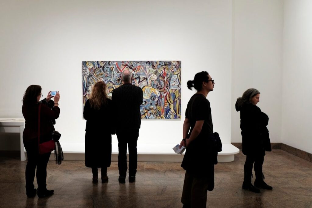
Many organizations house significant artworks – paintings, photography, sculpture, commissions dating from the 1980s to 2024 – that embody their true culture. Yet their digital presence relies on the same Corporate Memphis graphics as everyone else. That disconnect undermines brand coherence.
From Collection to Brand Narrative
Your curated art collection can be photographed, cataloged, and selectively incorporated into digital channels. A university, for example, might use its campus sculpture trail and 1990s mural commissions as hero imagery in admissions materials – creating a visual identity no competitor can replicate. But this requires knowing what you own, where each piece is, and whether you hold the rights to reproduce it.
Operational Challenges: Locations, Loans, and Condition
Artworks dispersed across multiple cities, pieces on long-term loan, inconsistent records, outdated spreadsheets, and missing condition reports all create risk. You cannot build a corporate art style around your collection if you lack reliable data about it. This is the operational problem that needs solving before any creative work begins.
How Onward Helps You Build a Cohesive Corporate Art Style
Onward’s platform enables you to move beyond generic Corporate Memphis toward a visual language rooted in your actual collection. Organizations using Onward report better visibility into their artworks, improved control of image rights, and easier collaboration between facilities, HR, branding, and curatorial teams. Core features include art inventory management, provenance documentation, art loan tracking, insurance management, location and condition monitoring, virtual exhibitions, secure cloud storage, and collection analytics.
Centralized Art Inventory and Provenance
Onward lets you catalog every artwork – artist, medium, acquisition date, provenance history, and current location – into a single source of truth via a centralized art log. A financial institution with offices in New York, London, and Hong Kong can consolidate decades of acquisitions from 1995 to 2025 into one system, reducing legal and reputational risk when featuring works in public-facing materials.
Image Rights, Secure Storage, and Virtual Exhibitions
Onward stores high-resolution images alongside rights documentation – usage permissions, reproduction limits, license expiry dates – in secure cloud storage. Design teams can quickly confirm whether a piece can be used on the homepage or in a 2026 annual report. Virtual exhibition features let you create curated digital shows embedded in intranets or microsites.
Analytics, Reporting, and Strategic Planning
Collection analytics help you understand distribution and utilization – identifying underused works in storage that could refresh high-traffic spaces. Knowing which periods, artists, or themes dominate your collection informs broader art direction and valuation decisions.
Best Practices for Choosing and Evolving Your Corporate Art Style
Audit Your Current Visual Assets
Conduct a 4–6 week audit covering your website, intranet, sales decks, HR materials, and physical art installations. Categorize each asset: Corporate Memphis vector, stock photography, original photography, reproductions of collection works, or commissioned illustration. Document mismatches – a heritage law firm using playful blue figures on its careers page while its offices display serious modernist paintings.
Define Principles for Your Corporate Art Style
Articulate 4–6 guiding principles: “authentic over abstract,” “collection-first,” “regionally rooted,” “material texture matters.” Include prompts: How should you depict people? How much abstraction is acceptable? Align with existing brand strategy and tone-of-voice guidelines so art style does not become an isolated aesthetic decision.
Integrate Corporate Art Management into Design Workflows
Create a regular handoff between the team managing the art collection and your brand team. Use Onward as the central place where designers browse approved artworks, download images, and check rights. Set quarterly review cadences to rotate featured works and keep your visual language evolving without a full rebrand.
Getting Started: From Generic Vectors to a Distinctive Corporate Art Language
The journey is straightforward: audit your visuals, centralize your art inventory in Onward, select 10–20 highlight works that embody your brand, and pilot updated visuals on one high-impact channel – your About page, your investor deck, your next annual report. You do not need to abandon illustration entirely. Blend thoughtful illustration style choices with a collection-first approach, and your brand will communicate something no stock library can replicate.
Your corporate art style should reflect what you actually own and what you actually do. Ready to align your visual identity with the art you already have? Get started with Onward to build a visual language that is distinctly, unmistakably yours.
Frequently Asked Questions
What is a corporate art style?
A corporate art style is the visual language and aesthetic used by organizations to represent their brand identity across digital and physical spaces. It includes elements like illustration, photography, color schemes, and design motifs that align with the company’s culture and values.
Why is choosing the right corporate art style important?
The right art style helps communicate your brand’s story, supports employee engagement, and enhances customer perception. It creates a cohesive and authentic visual identity that reflects what your organization truly represents.
How does corporate art style relate to a company’s culture?
Corporate art style can embody the values, history, and personality of a company. For example, incorporating artwork from your collection or regionally inspired designs can strengthen cultural connections and promote a sense of belonging.
What challenges do corporations face in managing their art collections?
Common challenges include tracking artwork locations, managing loans and condition reports, securing image rights, and ensuring accurate provenance documentation—all essential for maintaining a consistent corporate art style.
How can technology help with corporate art management?
Enterprise software solutions like Onward centralize art inventory, automate provenance research, manage image rights, and provide analytics. This streamlines workflows and supports consistent use of art assets in branding and communications.
How can organizations start developing or updating their corporate art style?
Begin by auditing existing visual assets, defining core principles aligned with your brand and job roles, and integrating artwork that resonates with your company’s identity. Collaborate across departments to ensure consistency and relevance.